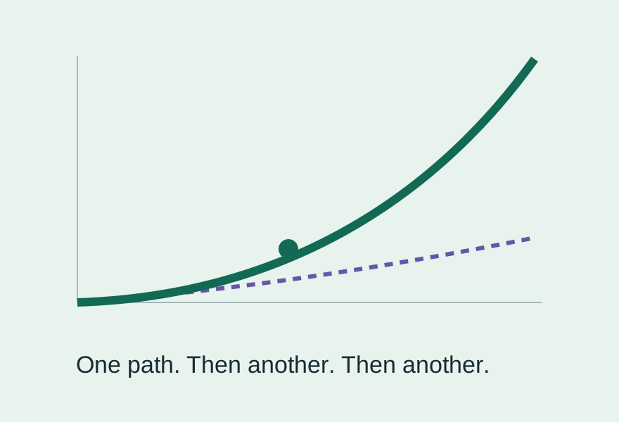
A · The reveal
How much curve is left?
Open the view. Add another path. Watch the combined curve pull away. Closest to the post’s opening idea.
Explore the curve →An interactive companion to the post
Your argument has a moment where the reader needs to see it: one improvement can make another more valuable. Here are three ways to make that moment interactive.
A · The reveal
Open the view. Add another path. Watch the combined curve pull away. Closest to the post’s opening idea.
Explore the curve →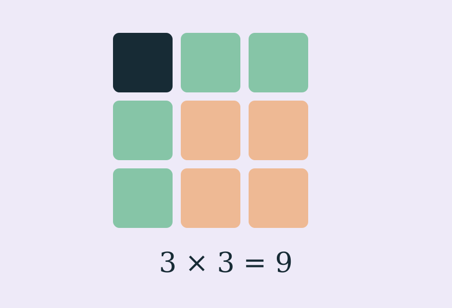
B · The explanation
Change two sliders. See the extra area that addition misses. The clearest answer to “why multiply?”
Try the grid →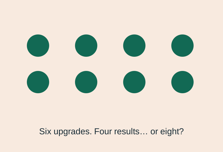
C · The game
Spend six upgrades. Compare one big push with several smaller ones. Then add a real-world limit.
Run the lab →Each option has a compact version and can save its current chart as a PNG. Put that image in Substack and link it to the interactive page. This also gives email readers a useful picture.
Substack does not allow custom HTML or iframe embeds in its post editor. Check the supported route ↗
All three use invented, visible assumptions. They explain how gains can multiply. They do not establish a universal equation for intelligence or tell us where we are on a future AI curve.
One change to make in the draft: classic scaling laws describe empirical power laws, not a required S-curve. Original scaling research ↗